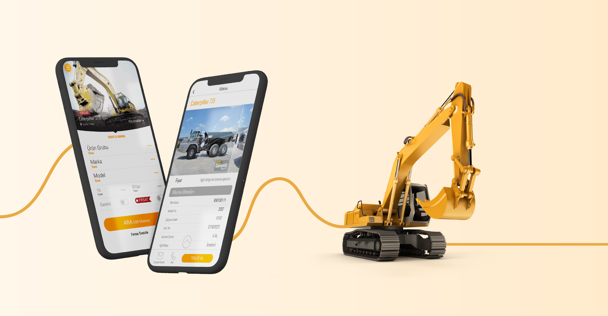
The Needs
An easy to use interface for mobile customers
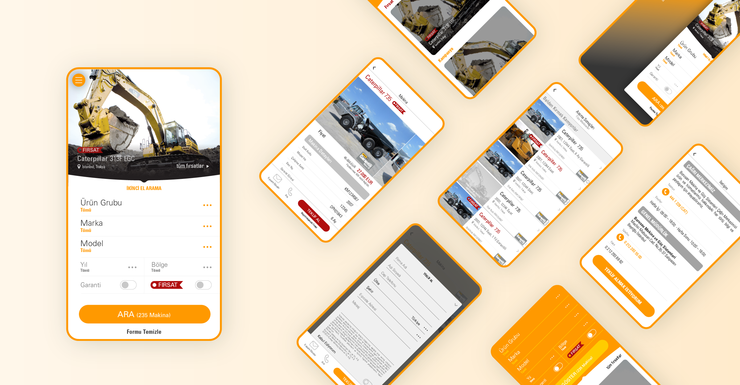
A neat and tidy product page design in order to see and easily compare the features of the products
A landing page for product information
Having the best customer journey to get a perfect ROI
A useful search tool for the customer to find the perfect matching product
The Challenge
A wide variety of users as decision makers (Engineers, purchasing managers, technicians, operators, contractors, investors and etc.)
A variety of products for different types of personas
The Solution
By keeping the user at the center of the design and development process we made user tests and user research in order to build the information architecture and prototype the creative process.
We combined accessibility, interaction, psychology, space and time in order to establish a multidisciplinary system for a better user experience. And involved branding, design, usability and function.
We captured the mindsets, blended creativity with the data we took from the website and combined it with a market research and the latest trends.
We built the landing pages, the application forms, the search tools for the best user experience.
With a smooth, easy-to-use and creative design; we created the best customers’ journey map in order to get a better ROI.
Further Analysis
Our Content Strategy team monitors and measures the traffic, the user behaviors, the ROI, the target audience and etc. for further analysis and creates monthly reports to make minor fixes and get better results.


