The Needs
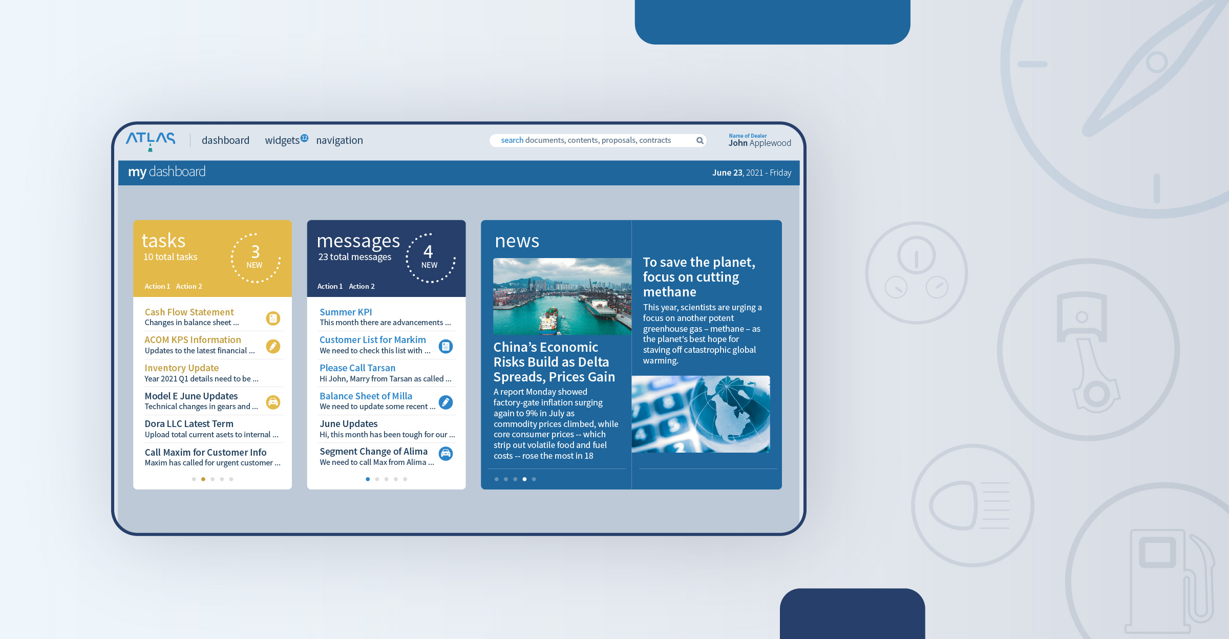
An end-to-end online platform for Financial Services starting from the application of a vehicle loan till the collection of the financials.
A perfect information bridge between the Dealers, the sales, the CRM, the risk managers and the collections team.
Detailed analysis, reporting and monitoring of the potential and the existing customers.
Tracking the payment tables, personal information and the whole finance management process of the clients.
Tracking and reporting all the phases of the customer status.
Dealing up with a wide variety of financial tables, information, analysis and reports about the processes.
Documentations and financials follow up.
Reporting to the Customer Relations (call center) team in order for them to communicate about the payments and conditions.
The Challenge
Variety of departments and differentiating needs of the multiple users.
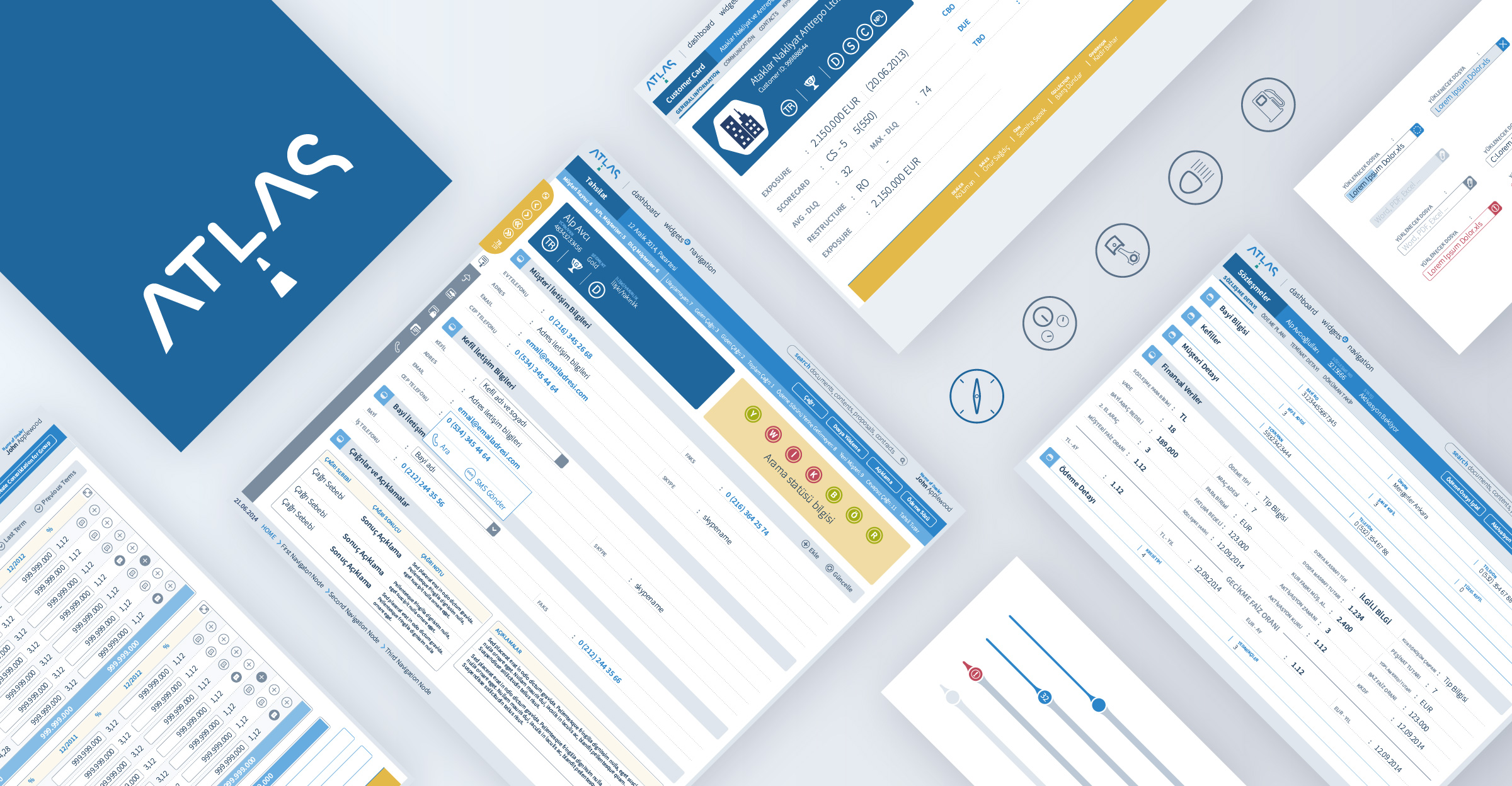
Diverse needs of screens with numerous tables, structures, data and content.
The Solution
The whole process and the needs of the departments were defined.
User cards and persona analysis were structured for each department and seniority levels.
The whole content and designs the users were conducting separately before this project were analyzed.
The best information architecture and user experience design output was aspired for an easy-to-use navigation.
An information architecture and a digital design guideline was built to acheive the best practice.
The essentials of the department staff were defined in order for them to benefit from the tools smoothly and quickly.
An agile project management system was adopted for a quick and effective outcome.
An easy-to-use and a clear navigation was built for the best user experience.


