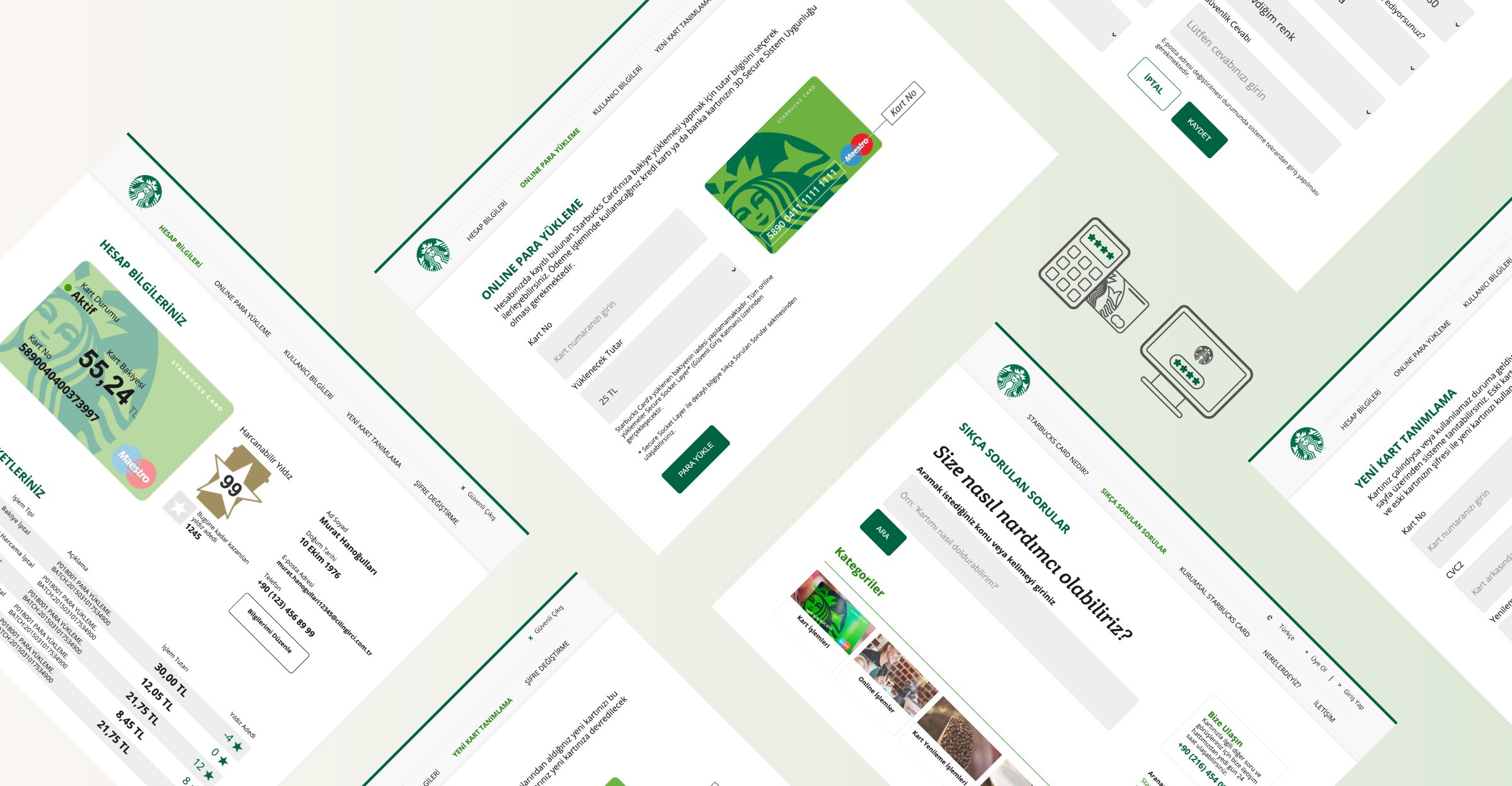
The Needs
A website to land and convert the customer in order to register for a brand new Starbucks Card.
A website to land the customer to download Starbucks Card Mobile Application to their smartphones.
To make people use their Starbucks Card more often.
To make the Starbucks Cardholders load money to their Starbucks Cards and use it at Starbucks Stores.
The Challenge
Making people register their Starbucks Cards to the system.
Making people use the Money Load system launched on the website.
Different types of personas and their attitudes towards such loyalty programs.
The Solution
The whole process and the needs of the personas were defined.
User tests and user cards were structured and developed.
Starbucks Card registration process was made easier and faster.
Videos and motion graphics were used to enhance the brand identity.
A simple and fresh design was built to get the best user experience.


